
How to Pick the Best Creative Banner for Your Event
Published June 30th, 2026
Community, school, and faith-based events thrive on connection and shared purpose, making banners more than mere signage-they become visual storytellers that embody the spirit of the gathering. A carefully chosen banner enhances visibility, ensuring every attendee feels welcomed and informed from the moment they arrive. Beyond practical function, creative banners capture the essence of the event's message, fostering a strong sense of identity and belonging among participants. Thoughtful design and innovative materials transform these displays into memorable landmarks that inspire and engage, inviting people to experience the event's heart and mission. As you explore the various types, sizes, and materials available, including unique options like glow-in-the-dark banners, you'll discover how each choice shapes the atmosphere and impact of your celebration, turning simple visuals into enduring symbols of community and creativity.
Understanding Banner Types and Materials for Outdoor and Indoor Use
Banner material drives how long it lasts, how strong it stands in weather, and how boldly it speaks into a space. Before you choose size or design, it helps to understand what each material does best.
Vinyl Banners
Vinyl is the workhorse for community event banners. It handles rain, sun, and wind better than most materials and keeps colors crisp. For outdoor fundraisers, school fairs, or church gatherings, vinyl offers strong durability and clear printing.
The trade-off is weight and bulk. Large vinyl banners need solid supports or stands, and they take more effort to fold, store, and carry. For quick setup or frequent transport, that extra heft becomes a factor.
Mesh Banners
Mesh banners use tiny perforations that let wind pass through. On fences, sports fields, or open parking lots, this reduces strain on grommets and zip ties and lowers the risk of tearing.
Mesh softens the image slightly because light passes through the holes. Text and graphics stay readable, but you lose a bit of saturation compared with solid vinyl. For windy outdoor community events, though, the increased stability often outweighs that loss.
Fabric Banners
Fabric banners bring a different kind of presence. They hang with a natural drape, absorb glare, and feel more like decor than equipment. Indoors, they work well for worship nights, school award ceremonies, and recurring programs where you want a warm, welcoming atmosphere.
Fabric is lighter and packs easily, but it is more vulnerable to moisture, stains, and fading in direct sun. Outdoors, it suits short-term use under cover, not long-term exposure.
Glow-in-the-Dark and Specialty Materials
Glow-in-the-dark banners add impact when light levels drop. Pigments in the material store light during the day or under indoor lighting and release a soft glow later. For evening community gatherings, youth events, or night walks, this turns the banner into a guiding point and conversation piece after sunset.
These specialty materials still rely on a base like vinyl or fabric, so the same rules of durability apply. A glow banner built on a vinyl base suits outdoor use and resists weather; a fabric-based glow piece fits indoor stages or hallways.
Portability and Installation
Material choice also shapes how easily you move and install the banner. Vinyl and mesh often use grommets with ropes, bungees, or zip ties for fences, railings, and temporary frames. They hold tension well but need anchors that can take the pull.
Fabric and some specialty banners work with pole pockets or lightweight stands, which suit indoor floors, stages, and entryways. Their lower weight makes transport simpler, though they need careful folding to avoid creases.
When you match material to environment-wind or calm, sun or shade, indoor or outdoor-you protect the banner's message and extend its life, event after event.
Choosing the Perfect Banner Size: Balancing Visibility and Space
Once material is settled, size decides how strongly the banner speaks and how comfortably it fits the venue. The aim is simple: large enough to read at a distance, small enough to respect the room and the people in it.
Start with viewing distance. A practical rule is that taller letters serve longer distances. If guests stand 10-20 feet away, moderate lettering on a medium banner works. For 50 feet or more, the banner and text both need to grow or the message fades into the background.
Matching size to event type
Small and medium banners suit classrooms, fellowship halls, and intimate assemblies. For a school awards night or a youth Bible study, a compact banner behind a podium or near the entrance anchors the theme without dominating the room. Paired with fabric or glow-in-the-dark material, it behaves more like art than infrastructure.
Large banners serve festivals, outdoor services, and multi-purpose gyms where people move around and sightlines shift. Vinyl or mesh works well at this scale because the structure carries the extra weight and tension. For a faith-based event banner stretched across a stage or above a parking-lot entrance, larger dimensions turn the message into a visible landmark.
Step-and-repeat backdrops sit in their own category. These wide, often taller pieces frame photo moments. The pattern repeats so logos, themes, or Scripture references appear in every snapshot. Fabric or soft-finish vinyl keeps glare low for cameras, while the generous size gives groups room to stand comfortably.
Space, clutter, and placement
Size must answer to placement. For banner placement for events, measure the available width and height, then subtract clearance for doors, lights, and exits. A banner that crowds fire sprinklers or blocks natural sightlines feels more like an obstacle than a welcome.
- Indoors, keep edges a bit inside walls and ceilings so the banner breathes visually.
- Outdoors, consider wind load, fence length, and how vehicles or pedestrians approach.
- Near a stage, leave enough margin so speakers, instruments, or decor do not hide key words.
Glow-in-the-dark banners benefit from thoughtful spacing. They draw eyes once house lights dim, so a modest size in a focused location-entry corridor, prayer corner, or registration zone-often has more impact than an oversized glow panel that competes with lighting and screens.
Cost, transport, and material choices
Larger pieces use more material, wider printing beds, and heavier hardware. That weight influences transport and storage. A festival-sized vinyl banner needs a vehicle with room to keep it rolled, plus sturdy supports on site. In contrast, several smaller fabric banners fold into a single tote for a school or community event banner display.
Material and size work together. Mesh and vinyl hold structure at large scales but add bulk. Fabric scales down gracefully for repeated indoor use and quick setups. Specialty glow materials add an overlay to whichever base you choose, so deciding how far the banner must travel and how often it will hang prevents surprises in shipping costs and setup time.
When visibility, space, and logistics align, the banner moves from simple signage to a quiet coordinator of experience, ready for the next layer of creative design.
Designing Banners That Capture Community Spirit and Inspire Engagement
Once structure and size are set, design becomes the voice of the banner. Color, type, and imagery decide whether people feel invited, encouraged, or simply informed. For community and faith-based events, design works best when it reflects shared values rather than trends.
Color that matches purpose and mood
Color carries emotion before anyone reads a word. Warm tones such as reds and oranges feel energetic and suit festivals, youth nights, and outreach events. Cooler blues and greens feel steady and calm, fitting prayer gatherings, school recognitions, or volunteer appreciation.
Anchor the palette to the event theme or community identity. School colors, church accent tones, or long-used community hues create instant recognition. Reserve one strong accent color for the key phrase so eyes land where they should. For glow-in-the-dark banners, keep backgrounds simple and use contrast so the glowing elements stand out once lights drop.
Typography that speaks clearly from a distance
Lettering needs to serve both emotion and clarity. Choose clean, open fonts for main statements and use decorative type sparingly for short words like "Joy," "Hope," or a single theme phrase. Script fonts lose legibility at distance, especially on textured or mesh materials, so keep them large and limited.
Establish a clear hierarchy:
- Primary line: event name or theme, bold and largest.
- Secondary line: date, location, or audience focus, smaller but still readable.
- Optional detail: brief instruction or tagline, shortest and simplest.
Space the letters generously. Tight spacing blurs from across a gym or parking lot, even when letter height follows typical banner design tips for visibility.
Imagery and symbols that feel local and true
Images work best when they feel rooted in real community life. Instead of generic stock art, consider silhouettes of a school mascot, a recognizable building outline, or simple icons that represent shared practices-hands raised, open books, musical notes, or a cross. Keep imagery bold, with clear shapes that remain recognizable when someone glances from across the field.
Limit the number of visual elements. One strong symbol beside the main phrase often has more power than a collage of smaller graphics that compete for attention.
Personalization that deepens emotional connection
Personal touches turn a banner into part of the story rather than a backdrop. Short Scripture verses, mission statements, or concise inspirational quotes tie the event message to deeper purpose. For recurring gatherings, a consistent theme line repeated each year builds identity and anticipation.
Other personalization ideas include:
- Highlighting the specific group or ministry hosting the event.
- Including the year so photo memories connect to a particular season.
- Leaving a light-colored band at the bottom where participants can sign or add brief notes during the event.
On glow-in-the-dark banners, reserve the luminous areas for the phrase or symbol that carries the heart of the event so the emotional center remains visible after dusk.
Clarity first, detail second
From a distance, people process shape before detail. Strong contrast between text and background, steady line spacing, and simple compositions support maximizing banner visual impact in busy environments. Any information that is not essential to attendance, direction, or theme belongs in smaller print elsewhere, not on the main banner.
When color, typography, imagery, and personalization work together, the banner stops acting as mere information and starts acting as a shared declaration-one that invites people not just to attend, but to belong.
Maximizing Visual Impact with Murphys Wow's Glow-in-the-Dark Banners
Glow-in-the-dark banners change once the lights dip. Instead of fading into the background, the message steps forward with a quiet, steady presence that keeps guiding people long after sunset. Murphys Wow builds on this effect with a signature glow-in-the-dark banner that treats darkness as part of the design, not a limitation.
The material uses pigments that absorb light from daylight or indoor fixtures, then release it slowly. That stored glow extends banner visibility beyond typical event hours, so evening worship nights, youth gatherings, or outdoor community walks keep a clear focal point even when overhead lighting softens. The effect is not harsh or blinding; it reads as a soft halo that draws attention without competing with people on stage.
Because the glow lives in the material, not just printed ink, the banner keeps doing its work while house lights pulse, screens shift, or candles flicker. This extra visibility changes how the space feels. Entrances feel more welcoming, prayer corners feel more intentional, and walkways feel safer because there is a visible anchor to move toward.
Placing glow banners for maximum presence
Placement decides whether that glow supports the event or distracts from it. Rather than centering a glow-in-the-dark banner in the brightest part of the room, set it just outside the strongest light so the luminous elements stay legible as surroundings dim. Transitional zones work especially well:
- Entry paths: Mount a glow banner near doors or along a key hallway so newcomers follow a visible message toward the gathering.
- Stage edges: Place it to one side of the platform, framing musicians or speakers without competing with screens or spotlights.
- Reflection spaces: Use a smaller glow piece near a prayer area, chapel corner, or quiet room so the glow supports focus rather than performance.
Outdoors, secure the banner where headlights, streetlamps, or porch lights give it time to absorb charge before the sky darkens. Fence lines, canopy fronts, and tent entrances all serve this purpose. The goal is simple: keep the glow visible from natural approach angles without blocking sightlines or emergency exits.
Working with light instead of against it
Glow-in-the-dark banners thrive when lighting feels intentional. Soft wash lighting above or below the banner provides enough charge while leaving contrast for the glow to stand out. String lights, lanterns, or dimmable cans aimed nearby keep faces lit and the room safe while the message or symbol continues to shine.
Color and design choices also shift once glow enters the picture. Darker, matte backgrounds recede so glowing text and icons hold center stage. Simple shapes and short phrases become easier to remember when they appear as the only bright forms in a dim corner or along a night path.
Murphys Wow treats these banners as more than signage. The aim is to weave faith-inspired creativity into the physical environment so people feel invited into something set apart-a gathering where imagination, message, and environment work together to point hearts toward higher purpose.
Strategic Placement and Installation Tips for Maximum Banner Effectiveness
Placement turns all the choices about material, size, and design into lived experience. The banner needs to intersect natural movement, not fight it. Walk the space the way guests will arrive, pause, and leave. Those paths reveal where a message will feel like a welcome instead of a billboard.
Key locations that carry the most weight
- Entry points: Position a welcome banner just beyond the doorway, not directly in it. Medium vinyl or fabric banners on stands or wall mounts work well here so guests see the theme as they enter without crowding the threshold.
- High-traffic corridors: For a school event banner in a hallway or lobby, hang it at eye level with clear clearance above heads. Use grommets with anchors into studs or approved rails so the banner stays flat and legible.
- Stage backdrops: Large banners behind or beside a platform act as visual anchors. Fabric or soft-finish vinyl on truss bars or crossbars avoids glare for cameras. Leave enough margin around edges so lights, screens, and instruments do not slice through key words.
- Photo and memory zones: Step-and-repeat backdrops or themed panels belong where people naturally gather between sessions. Sturdy frames with weighted bases keep them upright when groups lean in for pictures.
Mounting methods that respect material and venue
- Stands and frames: Use banner stands for indoor foyers, registration tables, and stage edges. They pair well with lighter fabric or smaller vinyl pieces and keep floors flexible for changing layouts.
- Poles and railings: For outdoor banner placement for events or along fences, mesh or vinyl with grommets, bungee cords, and zip ties handle tension and wind. Attach at multiple points along the top and bottom to prevent sagging and twisting.
- Ceiling and wall hangs: Where walls allow hardware, use hooks, cable, or approved adhesive systems. Pole pockets along the top edge keep fabric and glow-in-the-dark banners straight while still allowing a gentle drape.
Thoughtful placement supports both message and movement. Clear approaches, unobstructed exits, and sightlines that respect speakers and performers ensure the banner feels integrated with the event rather than pasted on top of it. When material, scale, and mounting match the flow of people through the space, the design does quiet work in the background, guiding attention, reinforcing purpose, and helping the gathering feel intentional from first step to final song.
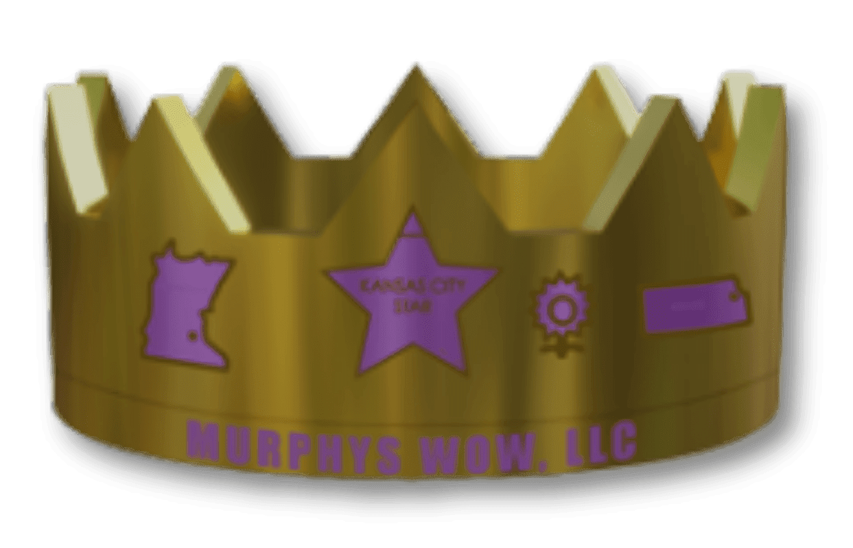
Choosing the perfect banner for your community event involves balancing material, size, design, and placement to create a vibrant centerpiece that resonates with your audience. Whether you select durable vinyl for outdoor visibility, elegant fabric for indoor warmth, or innovative glow-in-the-dark options that extend your message into the evening, every choice reflects your event's unique spirit and mission. Thoughtful design elements like color, typography, and meaningful imagery amplify connection and encourage participation, transforming banners from mere signage into expressions of identity and purpose. Murphys Wow, LLC, based in Roseville, Minnesota, brings creativity and faith-inspired vision to this process with original banners that inspire and engage, including their signature glow-in-the-dark creations that enhance atmosphere and draw attention after dusk. As you plan your next gathering, consider how a well-crafted banner from Murphys Wow can enrich the experience, making your event not only seen but truly remembered.
Share Your Creative Request
Have a question about our inventions or want to discuss a custom banner project? Get in touch with us today, and let us bring your creative ideas to life.
Contact Me
Office location
2775 Lexington Ave. N. #204, Roseville, MinnesotaGive us a call
(651) 313-4402Send us an email
[email protected]